Yolla Calls App For Android – A Major Redesign
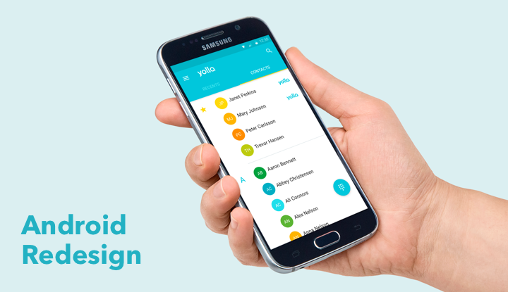
It’s the last month of summer but don’t get upset! We’ve prepared great news for all our Android users. Finally our calling app for Android can boast it’s brand new application design! We’ve made so many positive changes you will hardly recognize Yolla from the first sight.
Once again we took a look at Google Material Design guidelines and felt that we ought to enhance accordance to them and make Yolla even more material. :) Clear colours, picturesque and high-quality photos, thoughtful navigation through the whole app are now at the core of Android Yolla, which will make you fall in love with us even more. (As if that was possible, right?)
Navigation screen
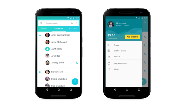
Since Android users are accustomed to the side navigation bars, we’ve remade the whole navigation screen. Now Yolla has floating side navigation bar which appears temporarily and overlays the native screen. That’s practical, comfortable, easy and works throughout the whole app.
As many users register more than one number in Yolla, we put information about current active one on the top of the side bar. There is also balance information, and you can top up easily from there by tapping “Add credits”.
Underneath users see all the pages available. For instance, now it’s much easier to see the “Rates” page - it’s always in front of you!
Contacts
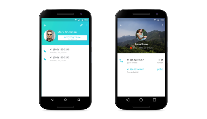
How cool is that: from 11pm to 8am of your contact’s local time we turn on the night mode. It's for you to be sure not to wake up your friends!
All in all, now your contacts look way better. Each country has its own picture, so you can easily define where exactly are calling - Germany or France, China or Mexico. We’ve added flags for each country too.
You can also see local time in your destination country. Another useful thing is the number of minutes you have left to call to this specific number and a button to top up directly from there. No need to count anymore!
Calls
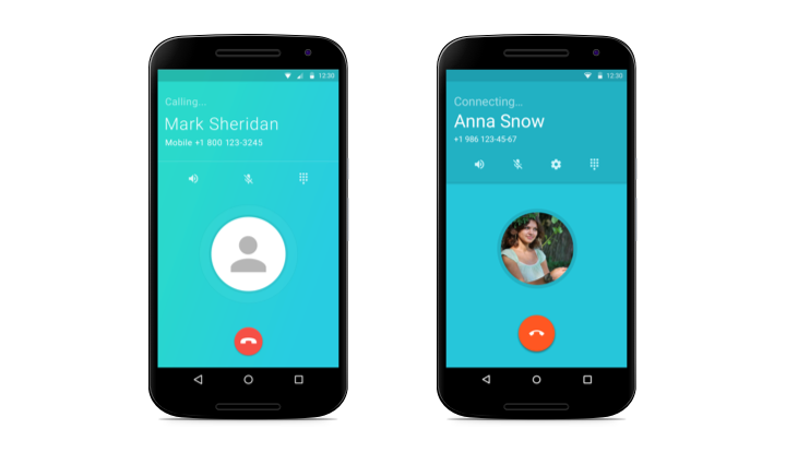
As natural as never before, now your call screen looks just amazing. Clean and simple, it reflects the whole Yolla application in one image. And in case of a poor Internet connection all the mistakes are displayed much clearer.
Native screens
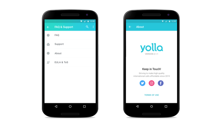
Only the most relevant information is displayed on the other screens of Yolla app now. We’ve remade them all for the best experience possible. Not to mention that they all look so beautiful and transparent!
Every day we strive to make our calling app for Android better. Keep in touch and Yolla will keep on surprising you! And don’t hesitate to review our app on Google Play or write directly to our support team in Yolla app. We would love to hear what you think of us!


